
Carob Tree
Carob Tree: One Identity for a World of Flavours
A full rebrand that put a family of street-food kitchens under one food-court identity, from the wordmark to the signage and the menu boards.
What we built.
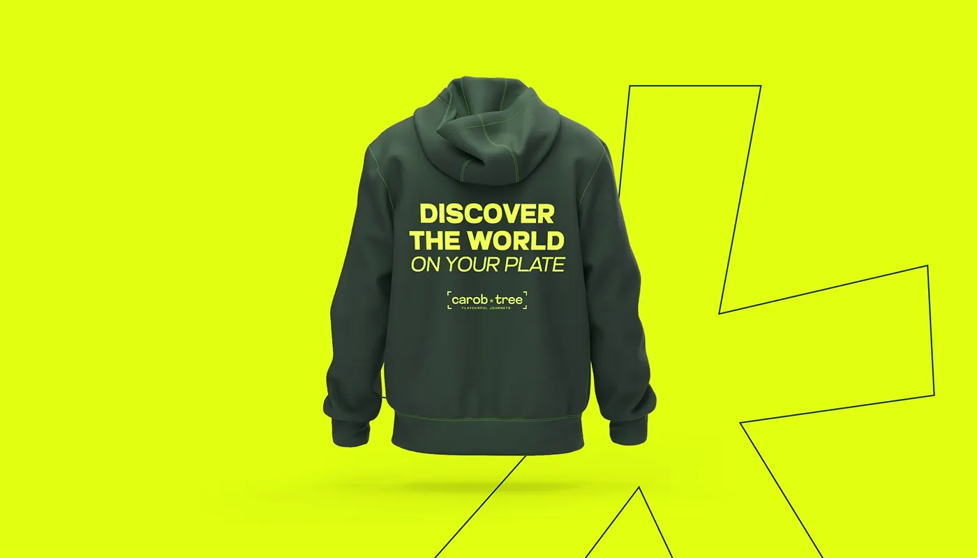
Carob Tree is a lively food court built around one promise: discover the world on your plate. Its kitchens bring the flavours of different cultures together in one place.
The brief was an identity ready for expansion. Lift the look of the brand, keep the sense of exploration and authenticity, and give everything a customer sees, from signage to social, a system it could grow into.
We rebuilt the identity from the ground up: a new wordmark, a palette of earthy and vibrant tones, a bold display typeface and new brand messaging, all designed to make discovery feel premium rather than chaotic.
Services delivered.
- BrandingA complete identity rebuild: wordmark, colour system, typography and brand messaging for the food court and its family of concepts.
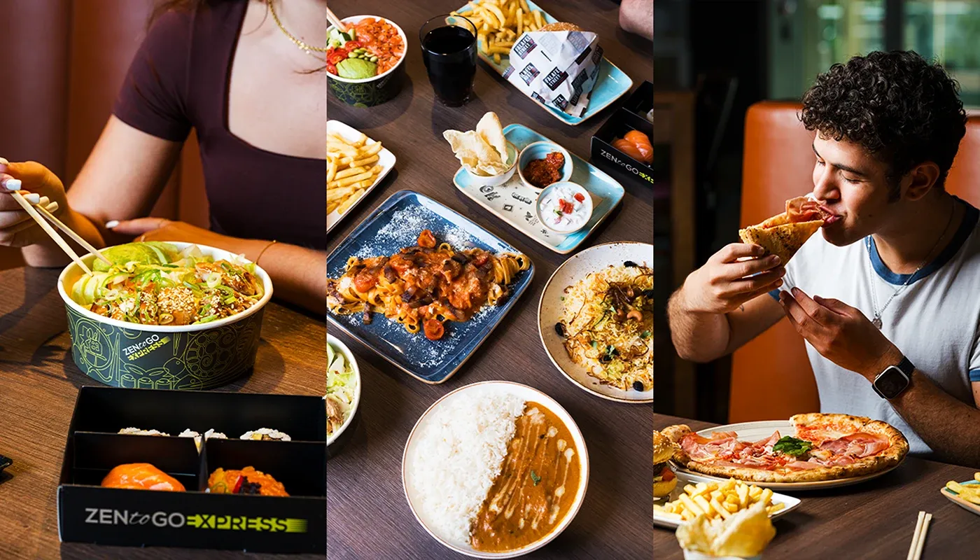
- Content CreationFood photography, video and campaign visuals that showcase the flavours behind the brand promise.
- Social Media ManagementA planned content calendar and targeted Facebook, Instagram and Google campaigns to keep the new identity in front of diners.
- Industry: Hospitality and food marketingRestaurants, bars and venues that need covers.
How we ran it.
- One brand, many kitchensUnified the family of street-food concepts under a single identity so every kitchen reinforces the same promise of discovery.
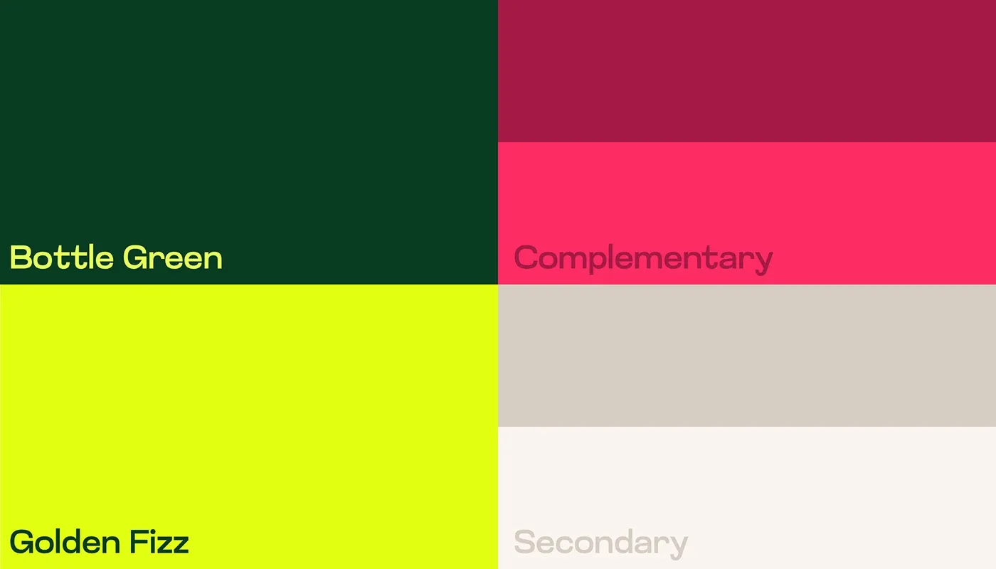
- Earthy meets vibrantBuilt the palette around a deep bottle green grounded in nature and heritage, cut with a golden fizz accent for energy and zest.
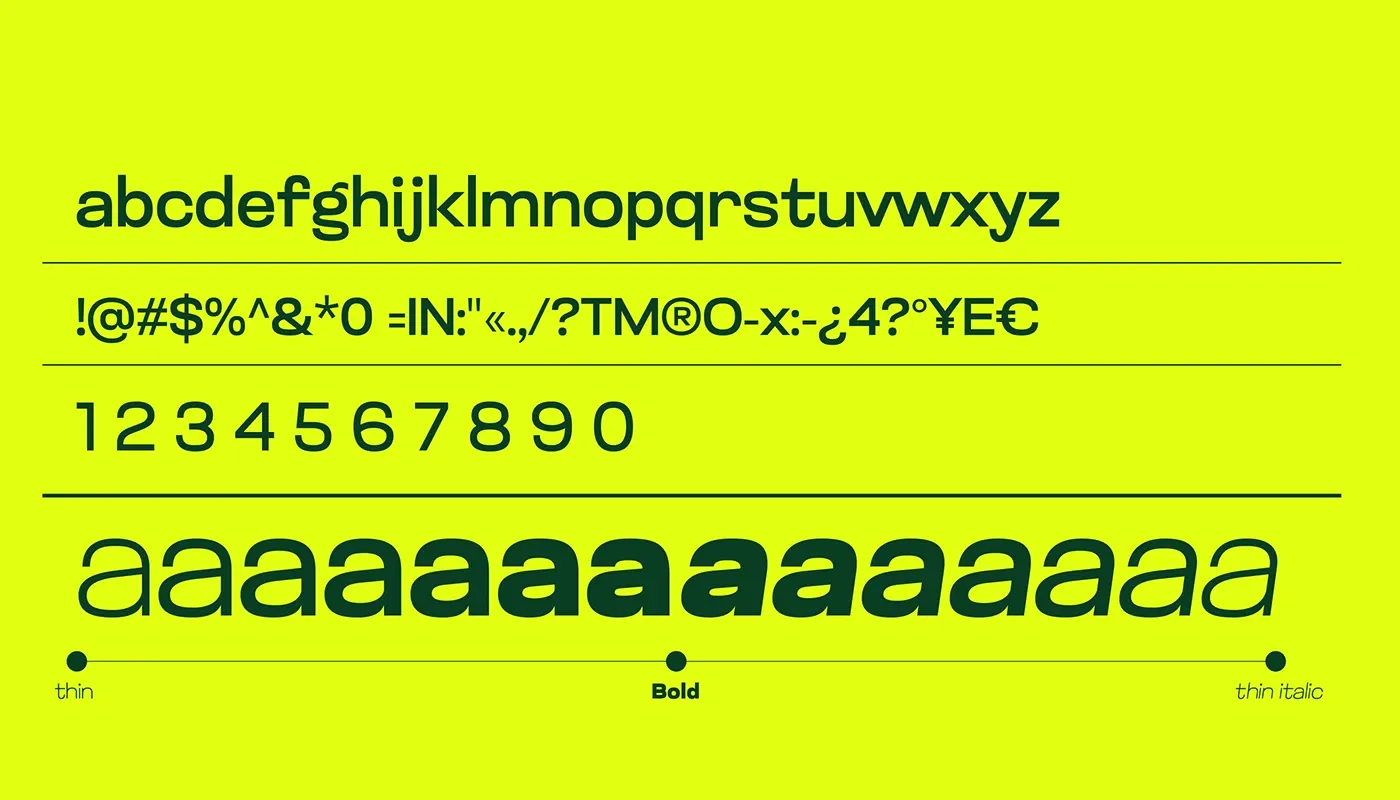
- A typeface that travelsChose the Glancyr display face for its clean, structured presence, legible from large-scale signage down to menu design.
- Quarterly content rhythmPlanned seasonal shoots and a monthly content calendar so the visual identity stays fresh without drifting off-system.
What it proved.
The Carob Tree rebrand did what a food-court identity rarely manages: it made variety feel like one brand instead of ten. With a defined visual and verbal identity, Carob Tree now presents itself as a sophisticated yet welcoming destination, equipped to expand its reach and build lasting loyalty.
- A modernised identity that keeps the original concept of global discovery intact
- A visual system built to stretch across signage, menus, packaging and digital
- A brand positioned for expansion, new audiences and lasting loyalty
From the studio
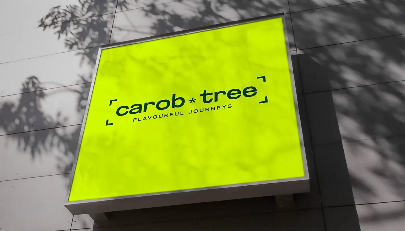
The identity, up close.
A new wordmark and visual language designed so every element speaks of exploration, variety and good food.
From the studio
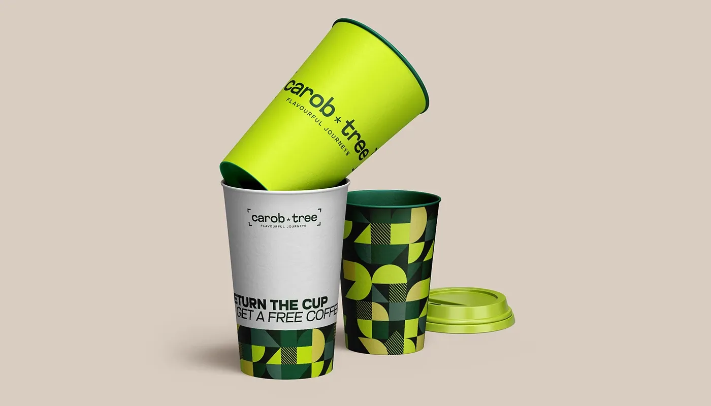
A palette of earthy and vibrant tones.
Bottle Green anchors the brand in freshness and heritage; Golden Fizz adds the zest, backed by energetic secondary hues and soft neutrals.
From the studio
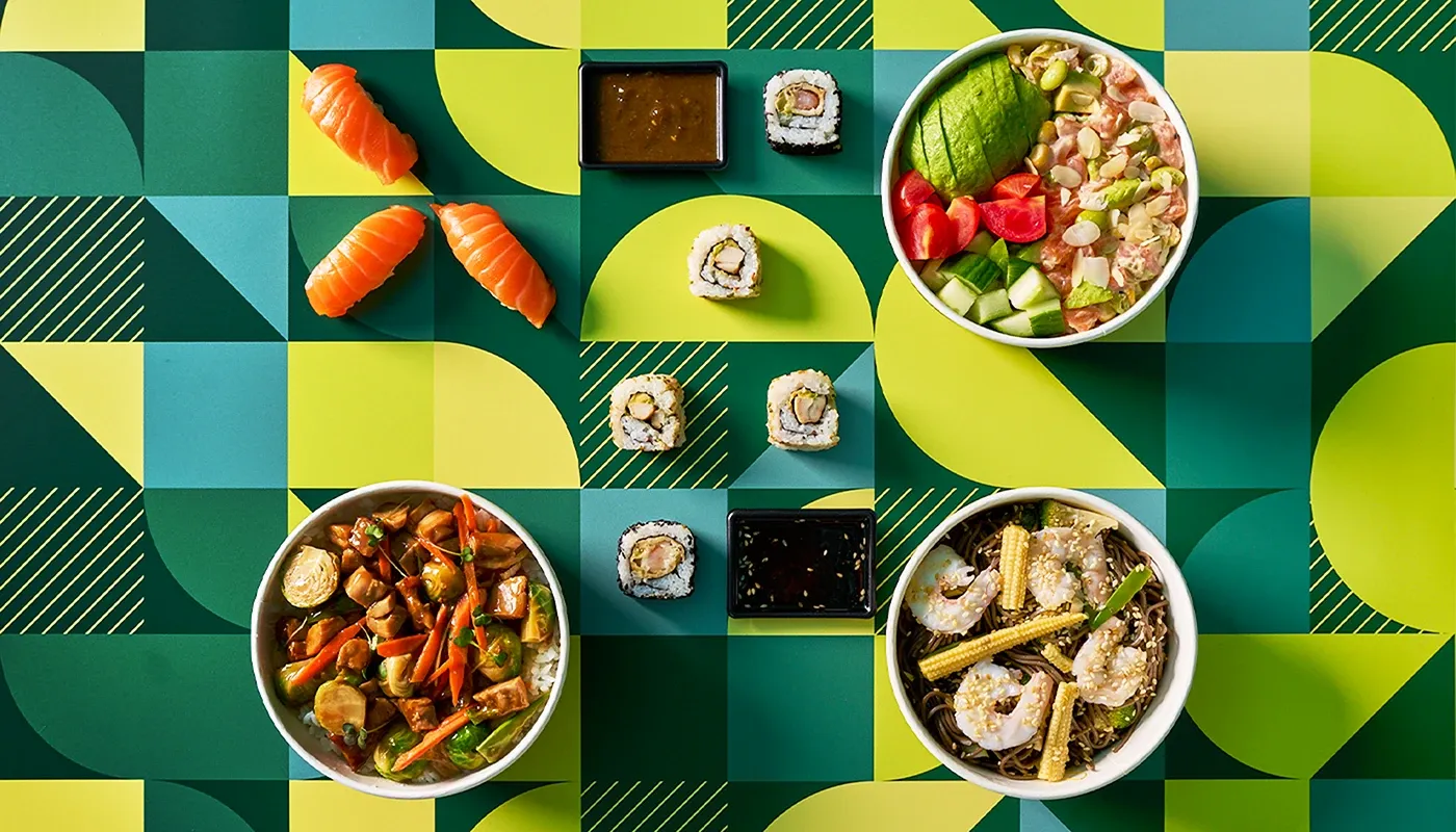
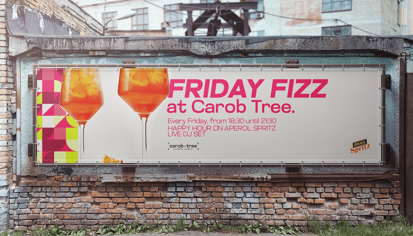
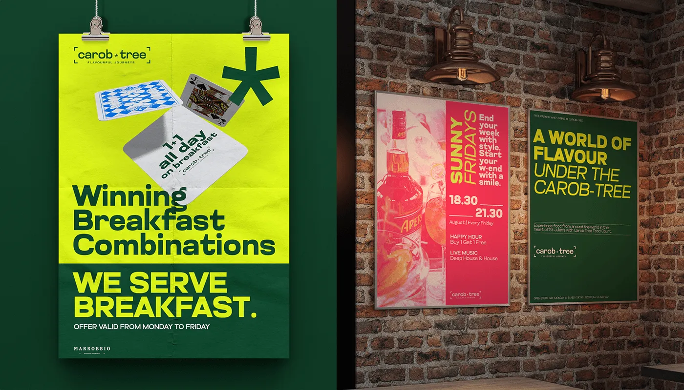
Typography and the brand in the wild.
The Glancyr display face carries the identity across signage, menus, merchandise and campaign ads.
What our clients say.
The Growth Bully's targeted approach brought us quality leads, increasing inquiries and bookings for Busy Bee. Their commitment made a real difference.

Duncan Friggieri
Business Development Manager at Busy BeeThe Growth Bully has been a true partner, delivering tailored strategies that drive lasting growth and impactful results.

Alexia Sant Manduca
Director at Fontanella Tea Garden & Vinum Wine BarThe Growth Bully revolutionized our eCommerce sales with precise targeting and optimized ads, achieving impressive ROI.

Carolina
Marketing Manager at LiquigasWorking with The Growth Bully has been seamless and rewarding. Their professionalism and strategic approach consistently deliver impressive results.

Joseph Barbara
Director at James CaterersThe Growth Bully has been an exceptional partner, combining professionalism and expertise to consistently deliver outstanding results.

Zach Ciappara
CEO at FreeHourWant this for your food brand?
Book a growth call. We look at what you are running, where the money leaks and what we would fix first.