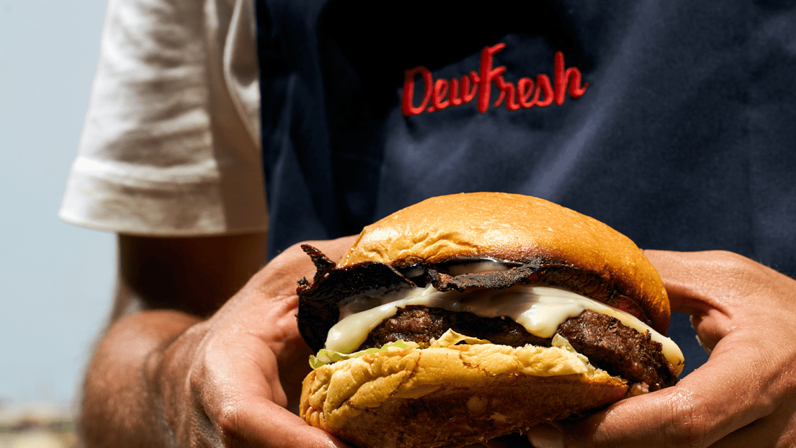


The Growth Bully collaborated with Dewfresh to transform their basic logo and colours into a polished, cohesive brand identity. Over three months, the project captured Dewfresh’s heritage and values, creating a robust identity that reflects their commitment to quality, trust, and community.
Comprehensive documentation to ensure consistent branding across all materials.
Defined an approachable and reliable brand personality for varied contexts.
Detailed instructions for correct logo application across formats.
Designed a primary and secondary palette with precise technical references.
Selected and demonstrated font usage for professional consistency.
Established a relatable, family-oriented visual style.
Created minimalist icons for packaging and marketing.
Comprehensive brand guidelines
Brand Consistency
Conducted detailed research into Dewfresh’s heritage and target audience.
Built on existing assets to modernise and enhance the brand.
Developed flexible guidelines for consistent application across materials.

The Growth Bully’s branding project for Dewfresh successfully bridged the gap between heritage and modernity. The detailed guidelines ensure consistency across all communications, supporting Dewfresh’s long-term growth while preserving their legacy.
Strengthened brand recognition and trust.
Established a consistent identity for versatile applications.
Positioned Dewfresh as a modern yet traditional leader in the food industry.