Da Vinci Hospital: A Rebrand Rooted in the Vitruvian Man
Re-imagining healthcare identity with the Da Vinci Cross, a mark built on harmony, symmetry and human-centred care.
Trusted by brands that don't settle for vanity metrics













What we built.
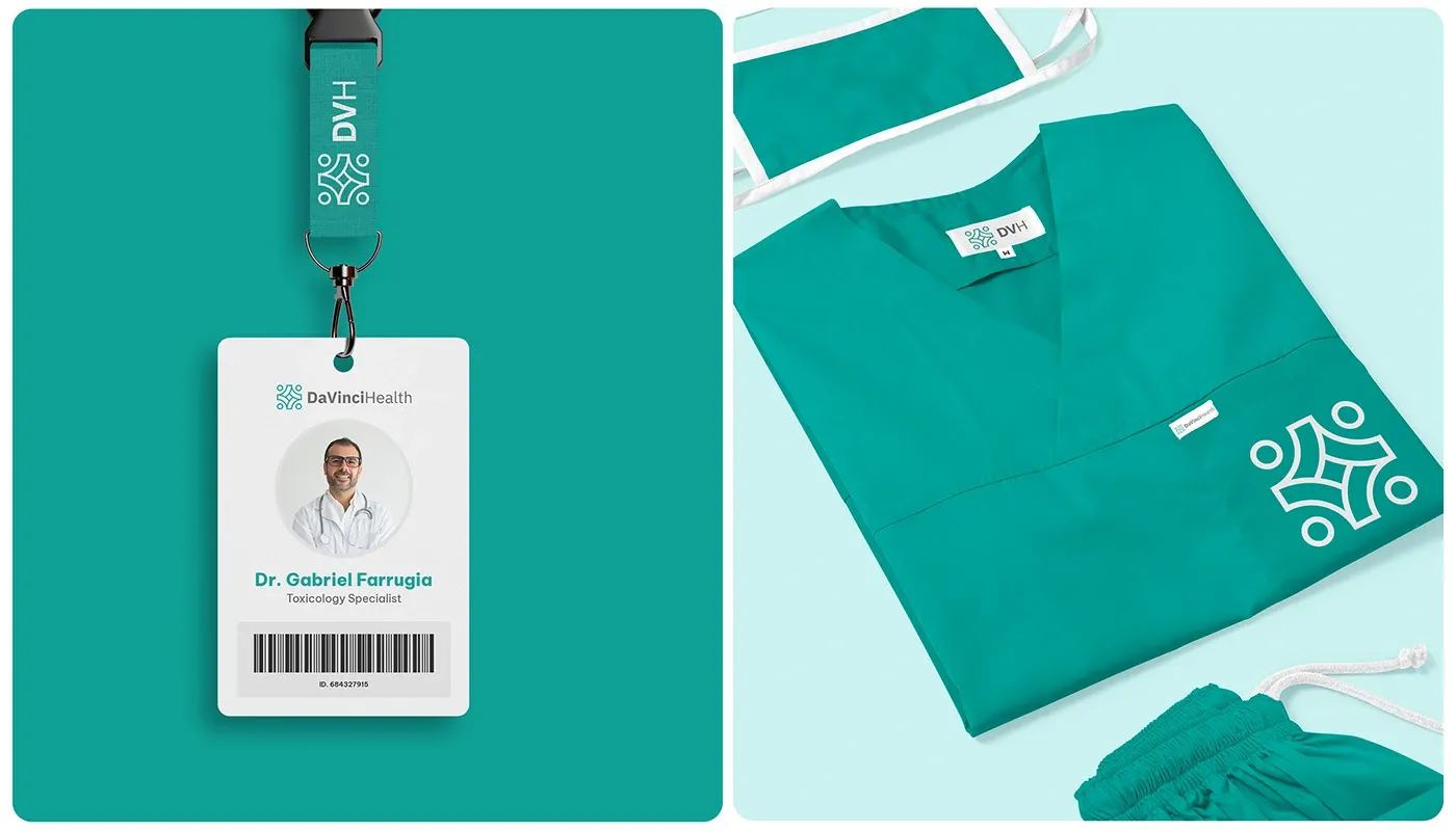
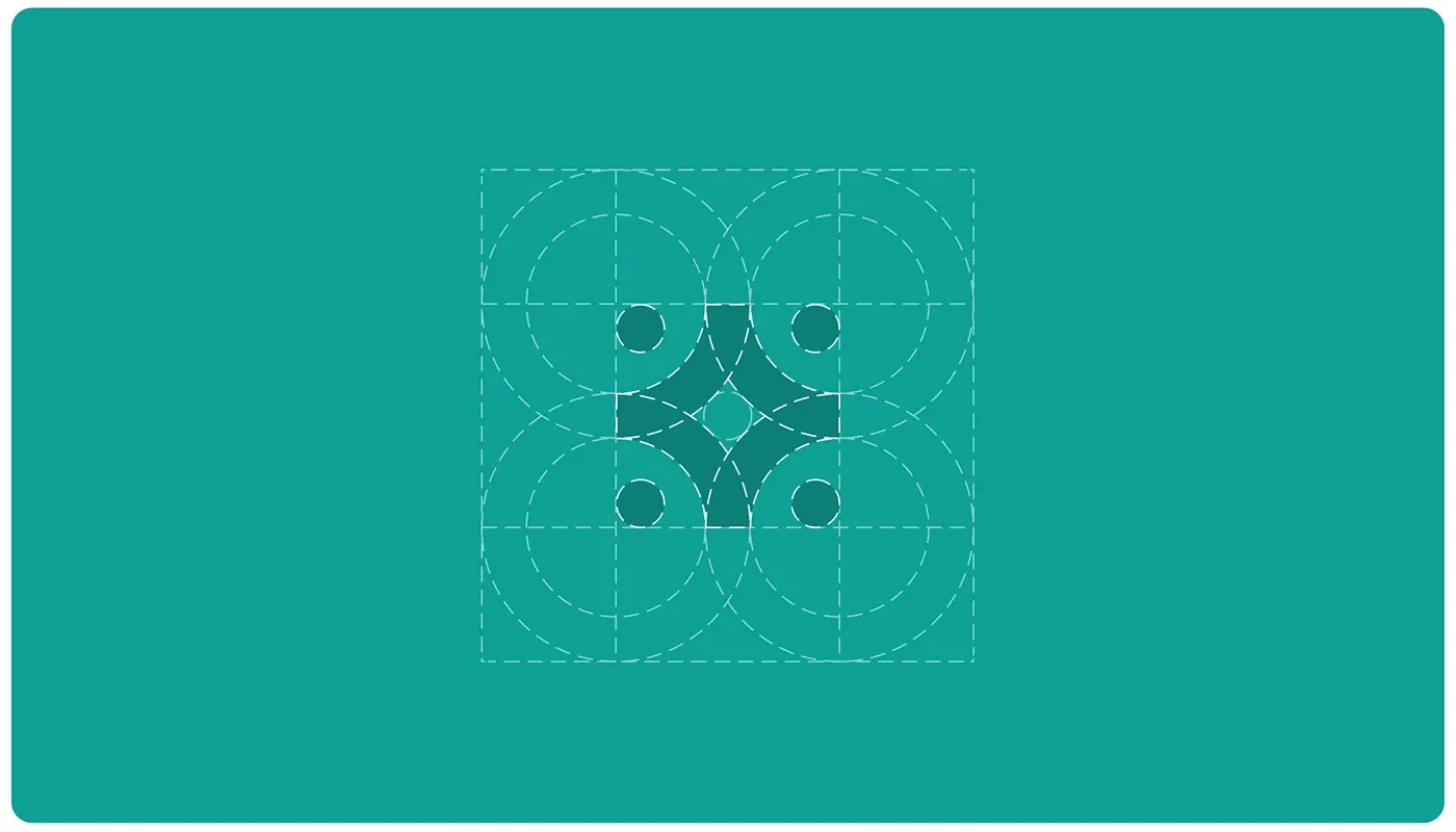
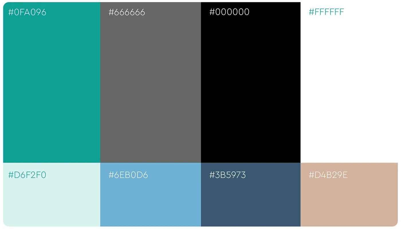
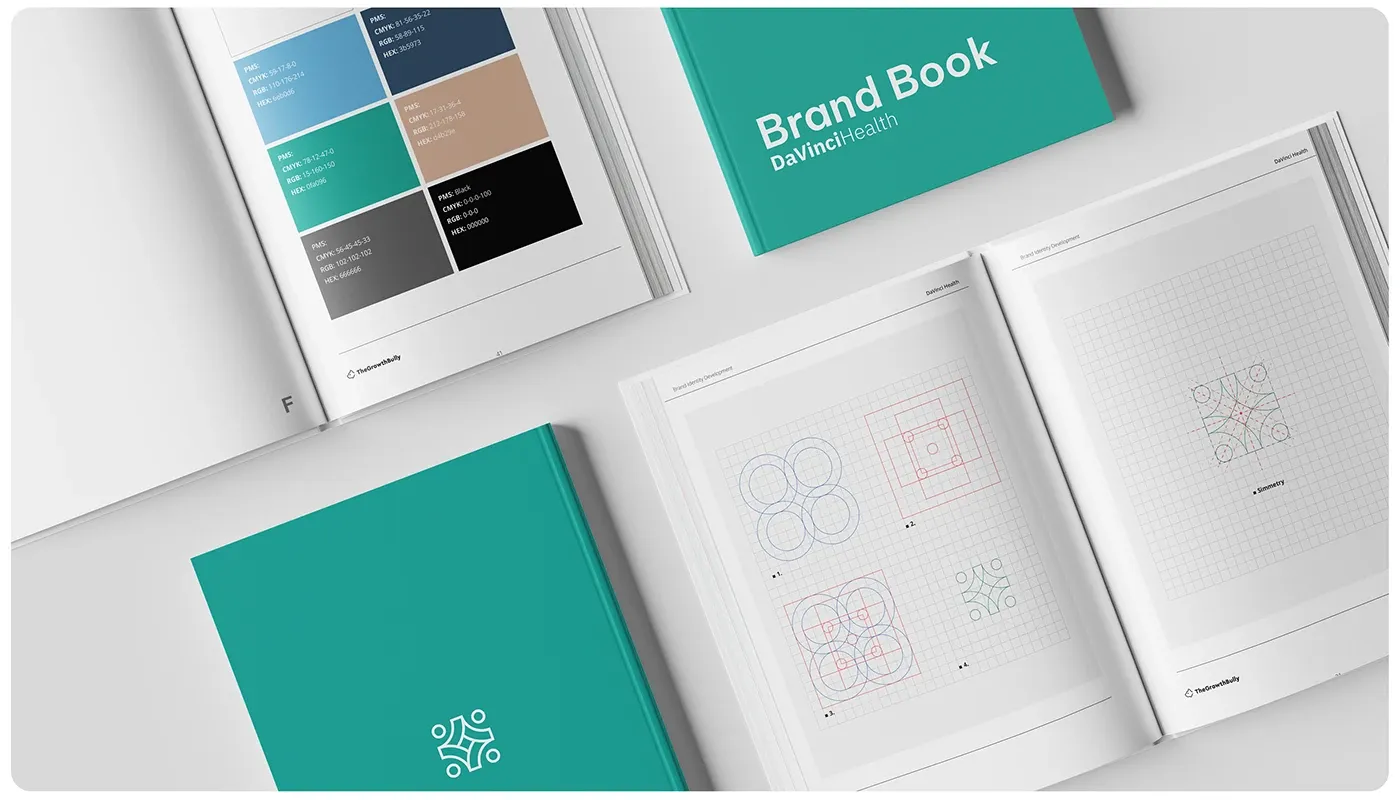
Healthcare brands have to do two difficult things at once: project clinical authority and feel human. Da Vinci Hospital's rebrand needed both, plus a system robust enough to work across departments, partnerships and every patient touchpoint. The centrepiece is the Da Vinci Cross. Inspired by the Vitruvian Man, it symbolises harmony, symmetry and inclusivity, the concepts at the core of the hospital's philosophy. Curved lines and dynamic shapes bring movement and progress; the bounding box provides structure and stability. Around the mark we built a complete system: IBM Plex Sans for readable, modern communication, Be Vietnam Pro for flexibility, calming blues and greens for wellness and trust, and custom logo lockups for departments and partnerships.
Services delivered.
Campaign strategies.
The Da Vinci Cross
Built the mark on the Vitruvian Man: harmony, symmetry and inclusivity rendered as a modern medical cross.
Approachable authority
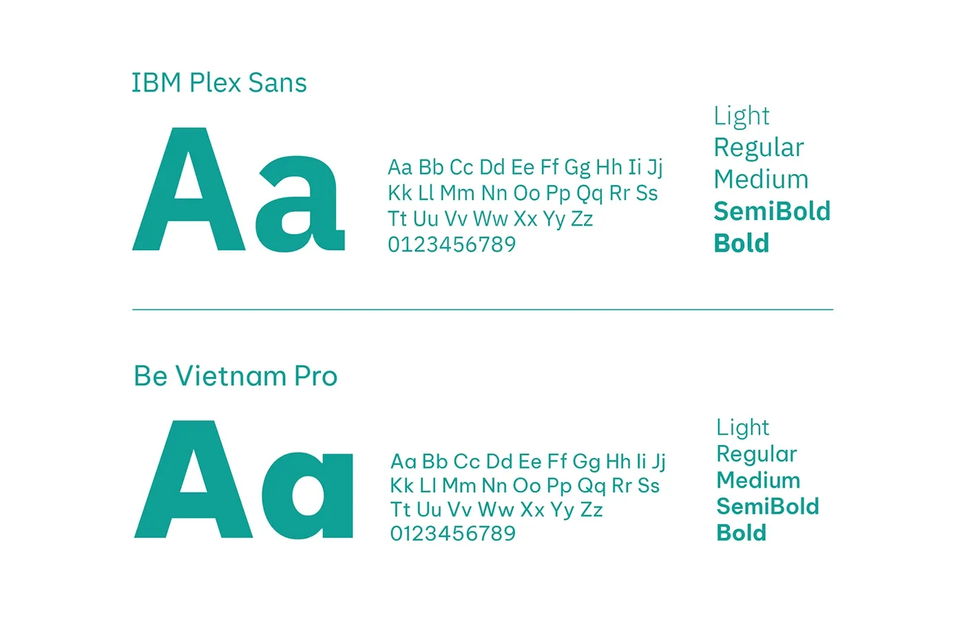
Paired IBM Plex Sans and Be Vietnam Pro for a tone that is professional without being cold.
A palette that reassures
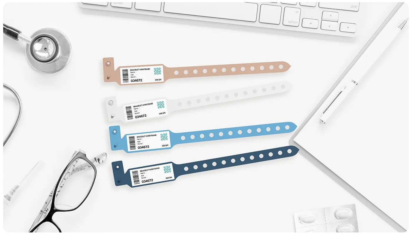
Calming blues and greens for wellness and trust, neutrals for professionalism, warm accents for empathy and energy.
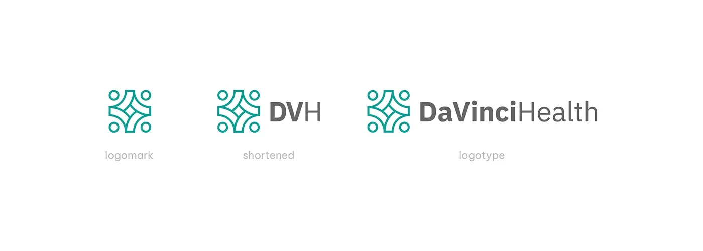
Lockups for every context
Designed custom logo lockups for partnerships, internal programmes and departments so the system flexes without fracturing.
What it proved.
Da Vinci Hospital now carries an identity worthy of its name: a brand system with a genuine idea at its centre, applied with the precision the sector demands. Recognisable, trustworthy and built for the future of the institution.
The advantage.
A distinctive, meaningful mark in a category full of generic crosses
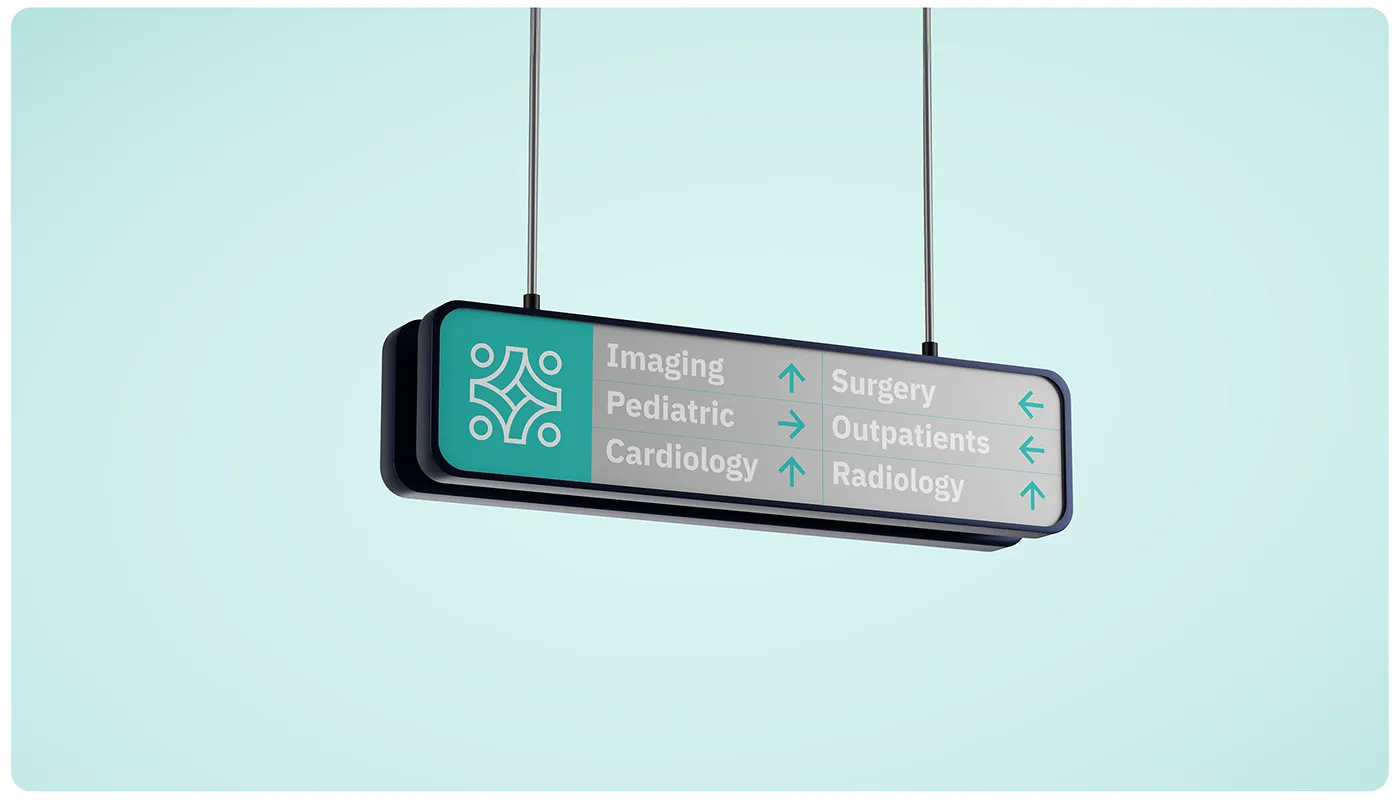
A cohesive system that holds from signage to digital interfaces
An identity that communicates trust, innovation and human-centred care
The Da Vinci Cross.
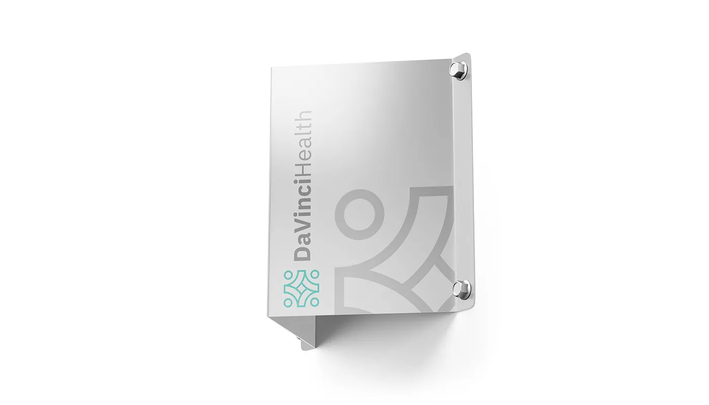
From Vitruvian Man sketches to the finished mark: harmony, symmetry and inclusivity in one symbol.

Typography and colour.
IBM Plex Sans and Be Vietnam Pro, set against calming blues and greens balanced with neutral tones.
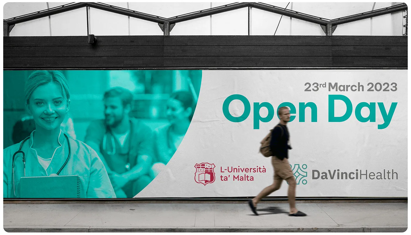
The system in application.
Signage, print, digital and wayfinding, one identity holding across every patient touchpoint.
What our clients say.
The Growth Bully's targeted approach brought us quality leads, increasing inquiries and bookings for Busy Bee. Their commitment made a real difference.

Duncan Friggieri
Business Development Manager at Busy BeeThe Growth Bully has been a true partner, delivering tailored strategies that drive lasting growth and impactful results.

Alexia Sant Manduca
Director at Fontanella Tea Garden & Vinum Wine BarThe Growth Bully's campaign boosted engagement and delivered results for our core skincare offerings.

Maria Bugeja
CEO at NiumeeThe Growth Bully revolutionized our eCommerce sales with precise targeting and optimized ads, achieving impressive ROI.

Carolina
Marketing Manager at LiquigasWorking with The Growth Bully has been seamless and rewarding. Their professionalism and strategic approach consistently deliver impressive results.

Joseph Barbara
Director at James CaterersThe Growth Bully has been an exceptional partner, combining professionalism and expertise to consistently deliver outstanding results.

Zach Ciappara
CEO at FreeHourOther projects.

Let's get started.
Book a call. We'll look at what you are running, where the money leaks, and what we would fix first.