Gen X: A Property Brand Built on the Infinity Loop
Brand identity for a Malta property management company, engineered around continuous service and a twin-house monogram.
Trusted by brands that don't settle for vanity metrics













What we built.
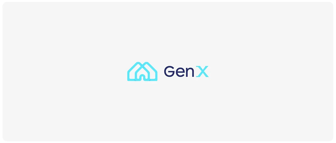
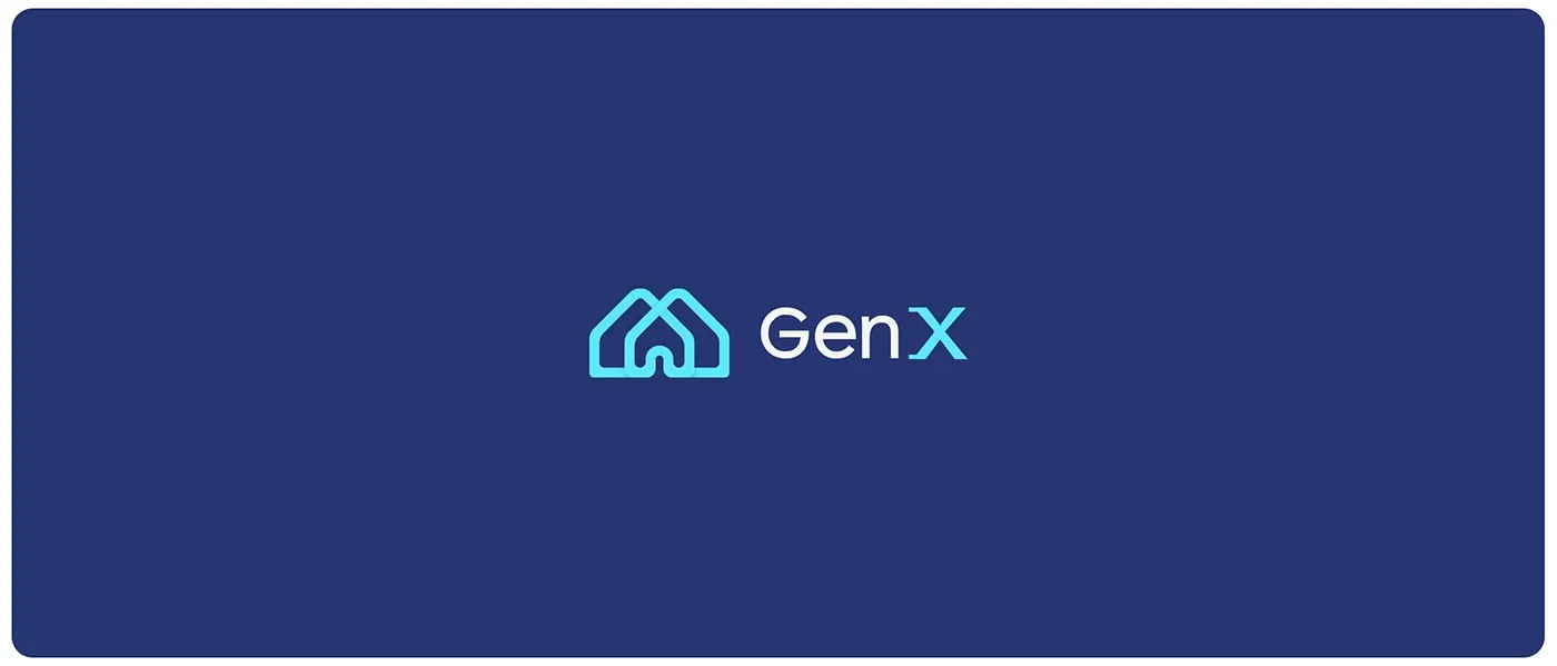
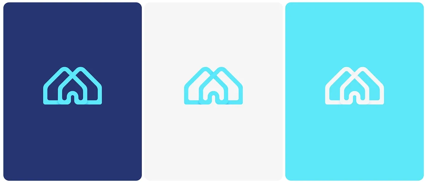
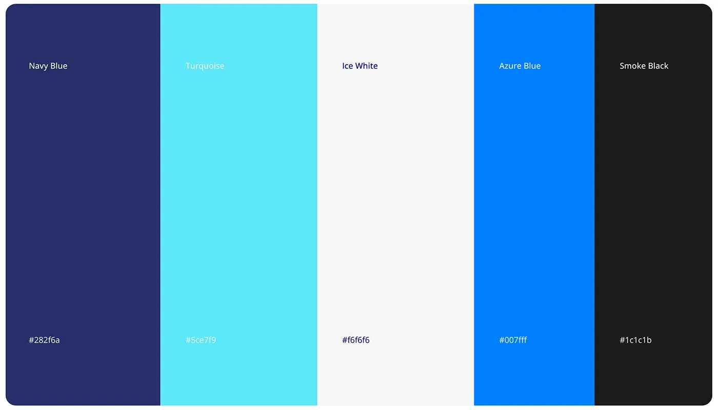
Gen X Property Management, operating under the umbrella of Ben Estates, set out to redefine property management in Malta: seamless solutions that maximise value for owners while giving tenants a superior experience, powered by technology rather than paperwork. The brand needed an identity to match that ambition. We built it around two ideas: an infinity loop, the symbol of an ever-evolving, hassle-free service model, and a stylised twin-house X monogram whose interconnected pathways link technology, property and people. Deep navy blue carries trust, stability and professionalism; vibrant cyan accents signal innovation and efficiency. Geometric patterns extend the system across every application, giving the brand a structured, modern voice that matches how it operates.
Services delivered.
Campaign strategies.
The infinity loop
Anchored the identity in a symbol of continuous improvement and long-term, hassle-free management.
A monogram with meaning
Designed the twin-house X as interconnected pathways linking technology, property management and customer satisfaction.
Colour as positioning
Paired deep navy for trust and stability with cyan accents for innovation and cutting-edge efficiency.
Patterns that scale
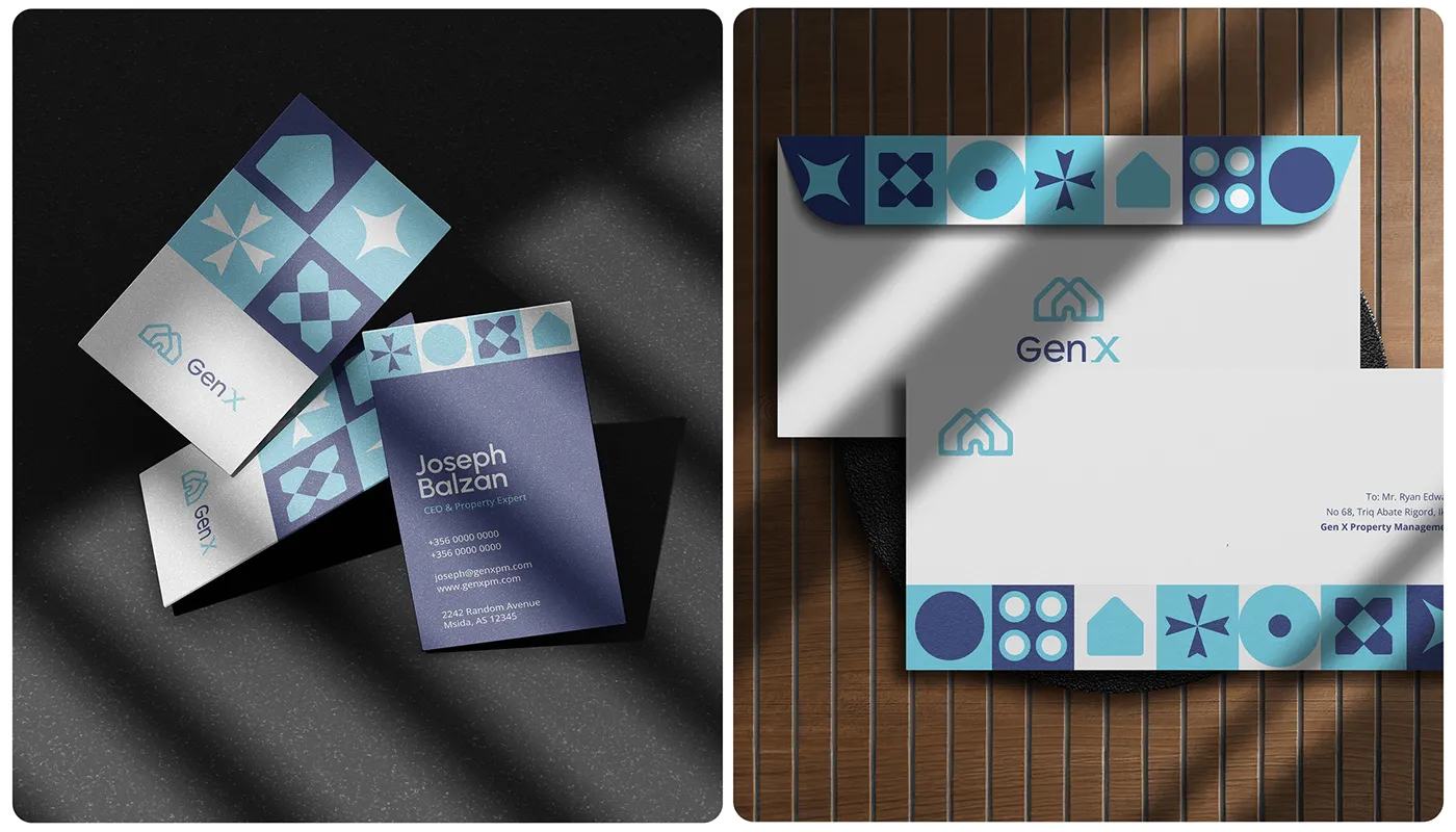
Built a geometric pattern system that carries the brand across stationery, signage, digital and wayfinding.
What it proved.
Gen X is not just managing properties, it is redefining how property management looks and feels. The infinity loop, the twin-house monogram and the structured pattern system give the company an identity that communicates exactly what it promises: seamless, continuous, professional service.
The advantage.
A distinctive identity in a market that usually looks interchangeable
A visual system structured enough to grow with the service offering
Brand equity that positions Gen X as the tech-driven, transparent choice
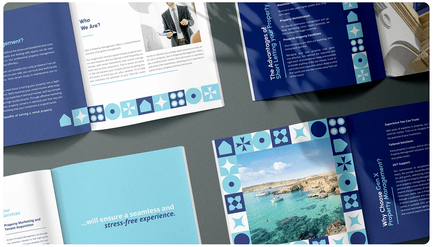
The mark and the system.
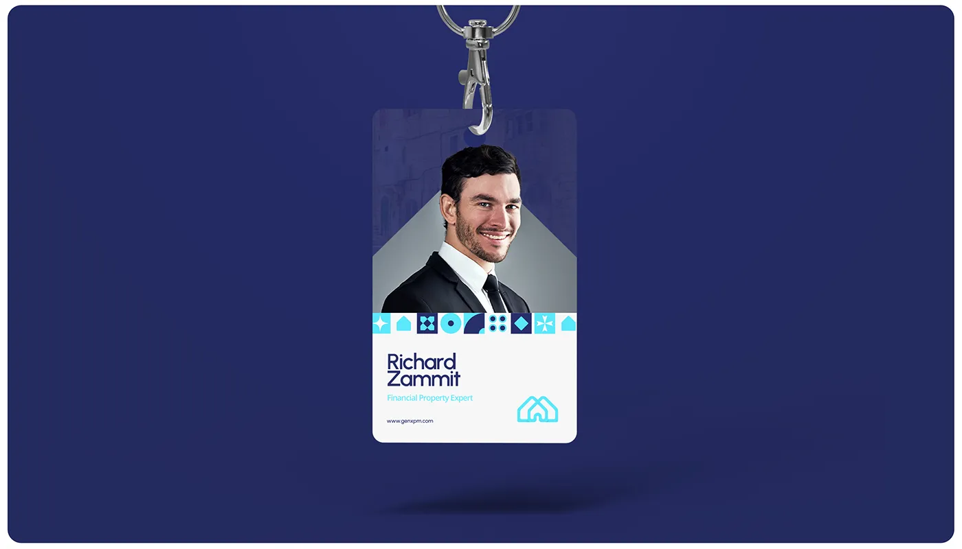
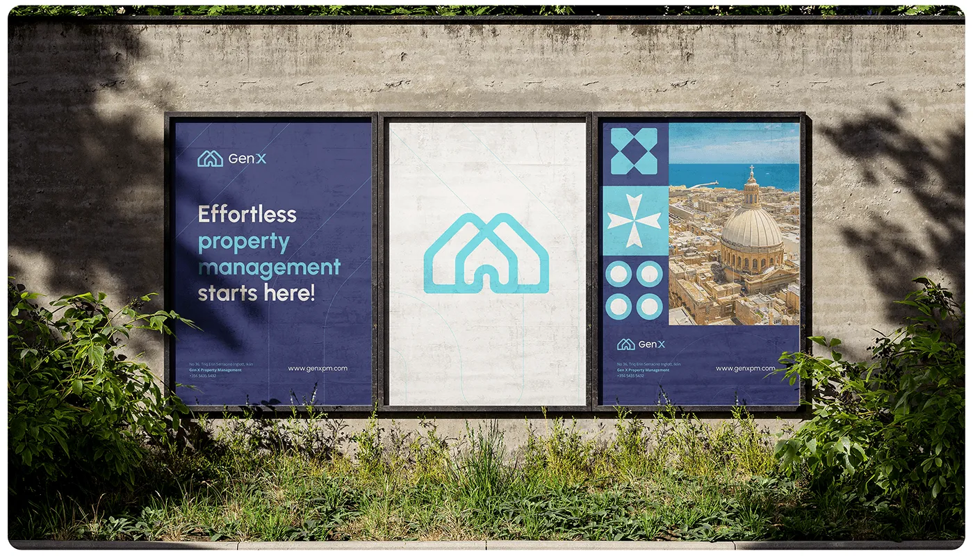
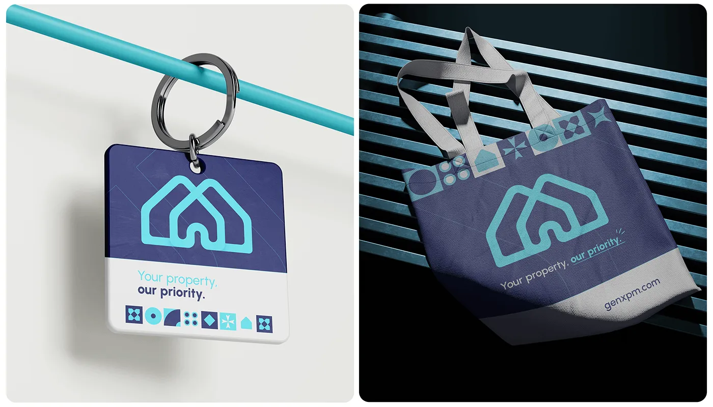
The twin-house monogram, logotype and core identity elements that anchor the brand.
Geometric patterns in motion.
Carefully designed geometric elements reinforce the brand's modernity and give every application a structured, dynamic rhythm.
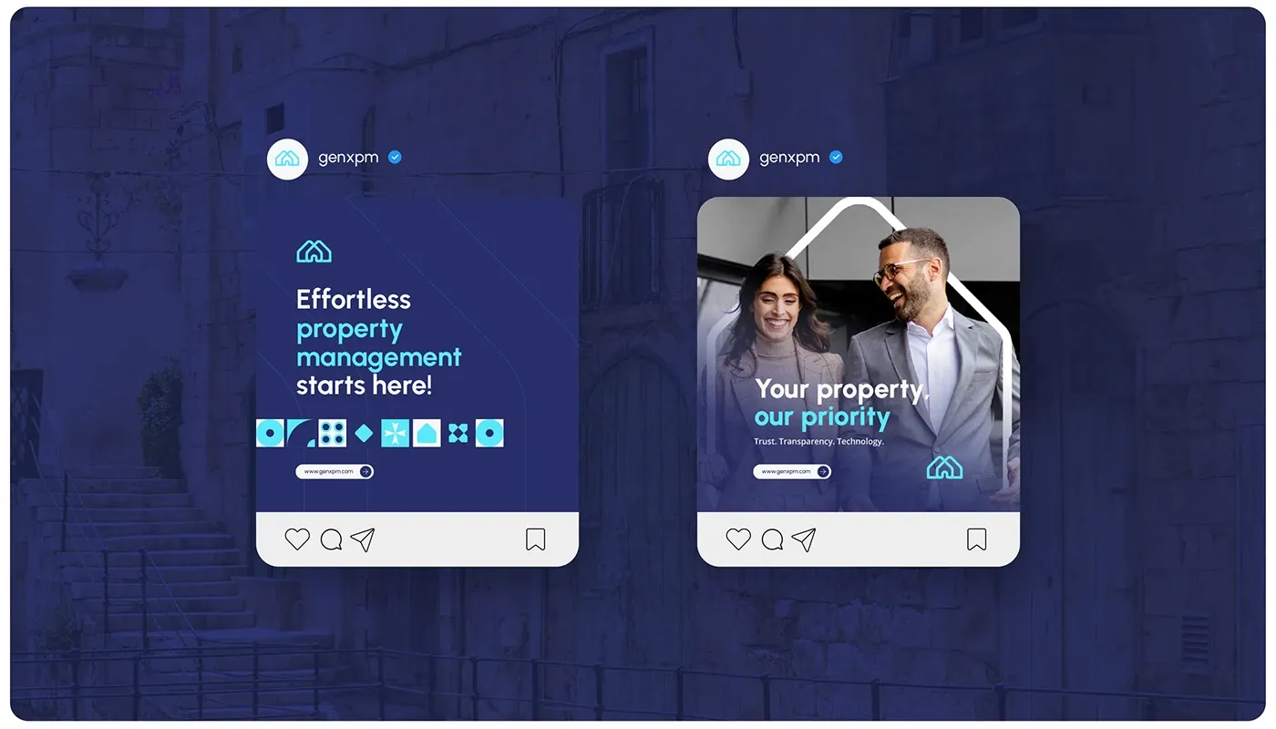
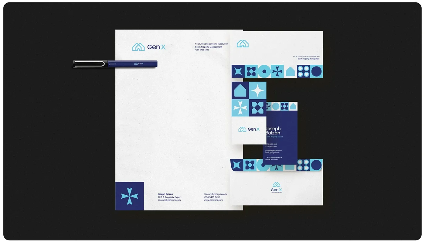
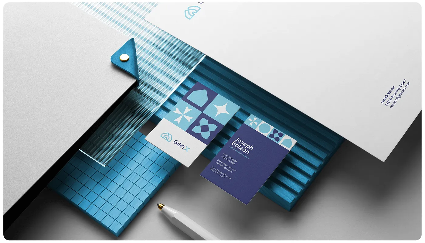
The brand in application.
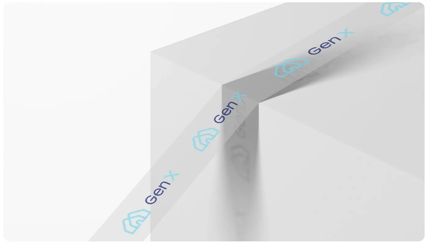
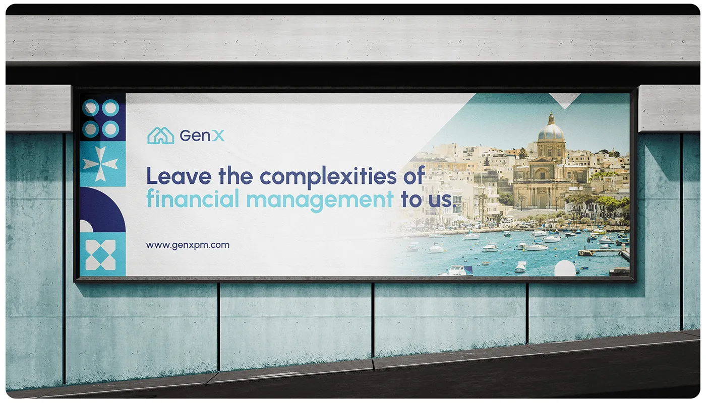
Stationery, signage, digital and collateral, one system carrying the identity across every touchpoint.
What our clients say.
The Growth Bully's targeted approach brought us quality leads, increasing inquiries and bookings for Busy Bee. Their commitment made a real difference.

Duncan Friggieri
Business Development Manager at Busy BeeThe Growth Bully has been a true partner, delivering tailored strategies that drive lasting growth and impactful results.

Alexia Sant Manduca
Director at Fontanella Tea Garden & Vinum Wine BarThe Growth Bully's campaign boosted engagement and delivered results for our core skincare offerings.

Maria Bugeja
CEO at NiumeeThe Growth Bully revolutionized our eCommerce sales with precise targeting and optimized ads, achieving impressive ROI.

Carolina
Marketing Manager at LiquigasWorking with The Growth Bully has been seamless and rewarding. Their professionalism and strategic approach consistently deliver impressive results.

Joseph Barbara
Director at James CaterersThe Growth Bully has been an exceptional partner, combining professionalism and expertise to consistently deliver outstanding results.

Zach Ciappara
CEO at FreeHourOther projects.

Let's get started.
Book a call. We'll look at what you are running, where the money leaks, and what we would fix first.