IO Labs: A Brand Identity Engineered Like Its Technology
The blueprint of innovation: a molecular, brain-inspired identity for an AI and real-time analytics company.
Trusted by brands that don't settle for vanity metrics













What we built.
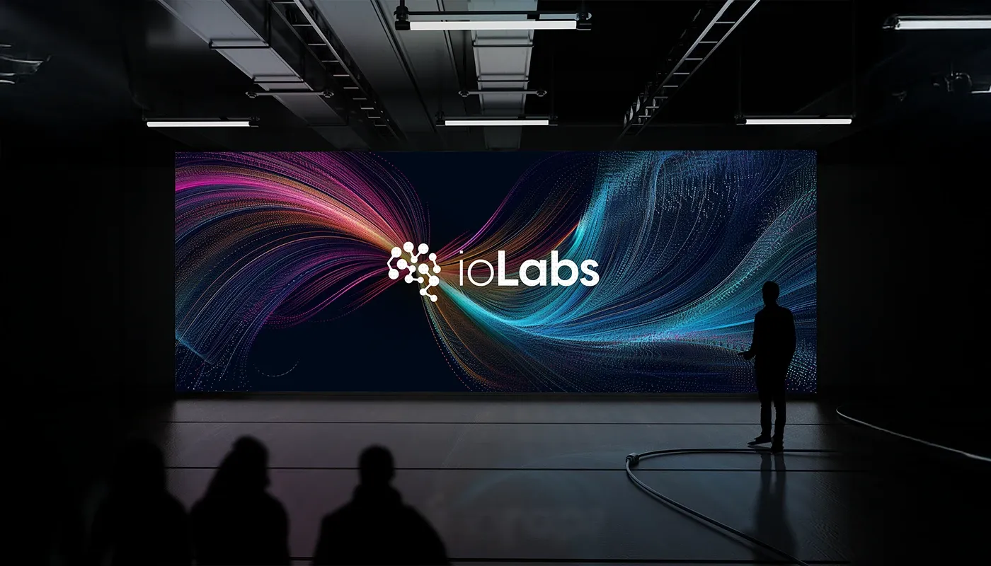
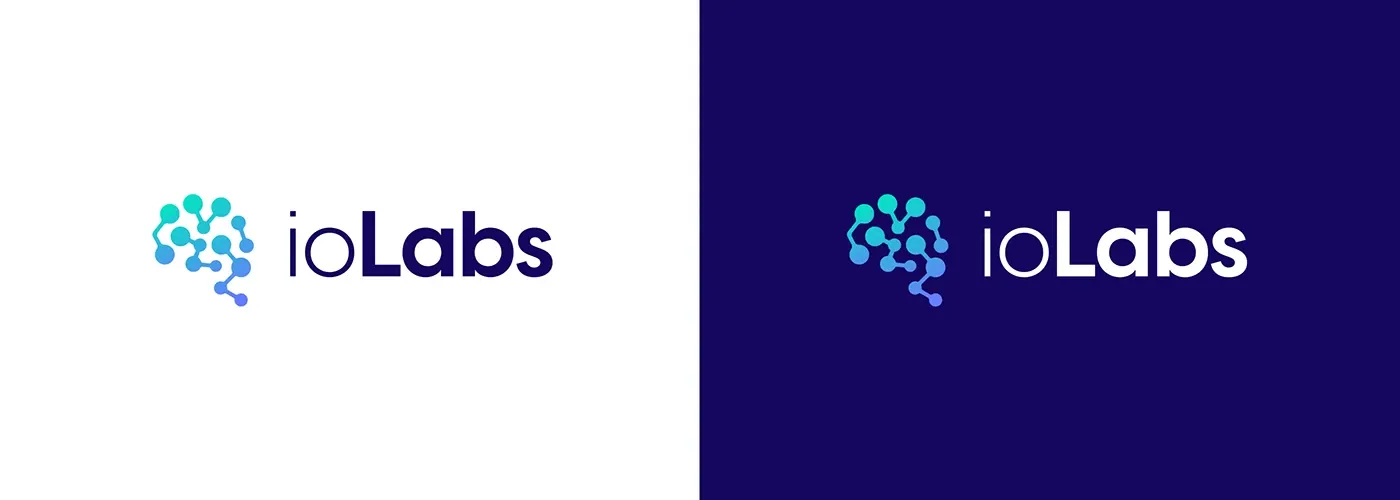
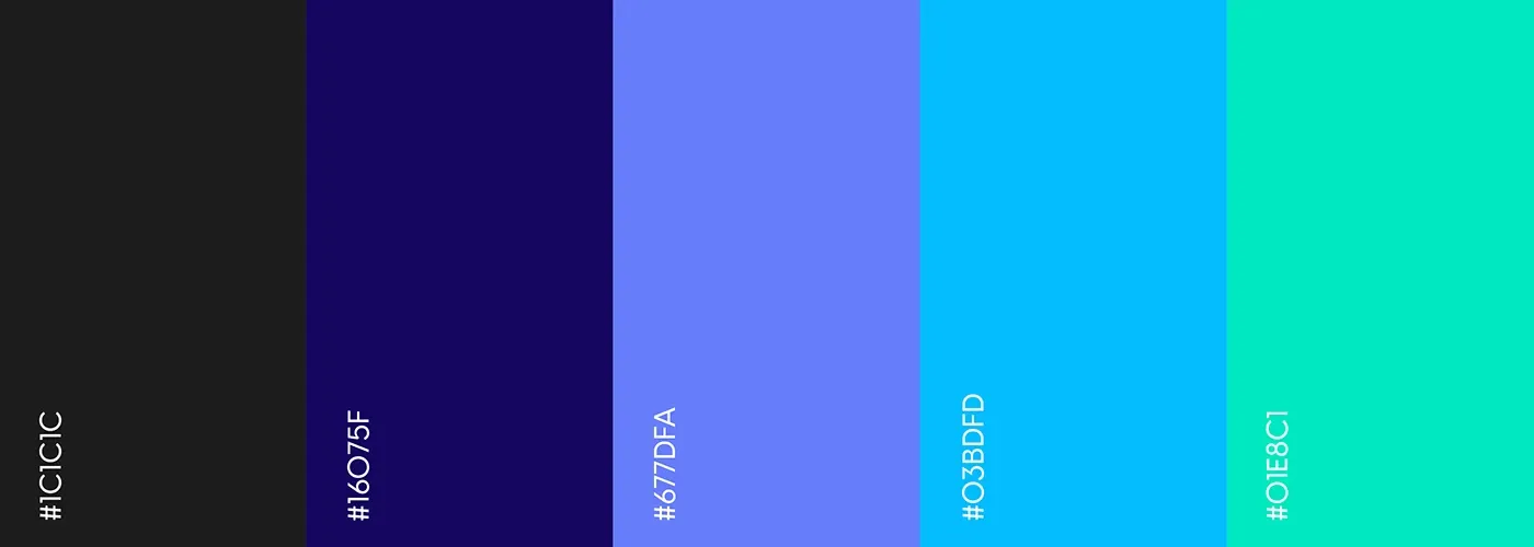
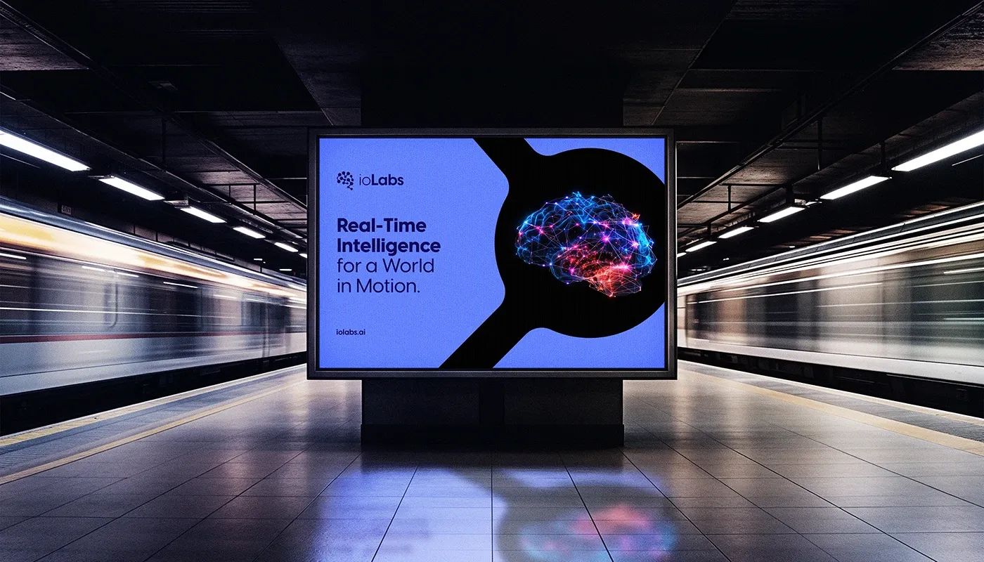
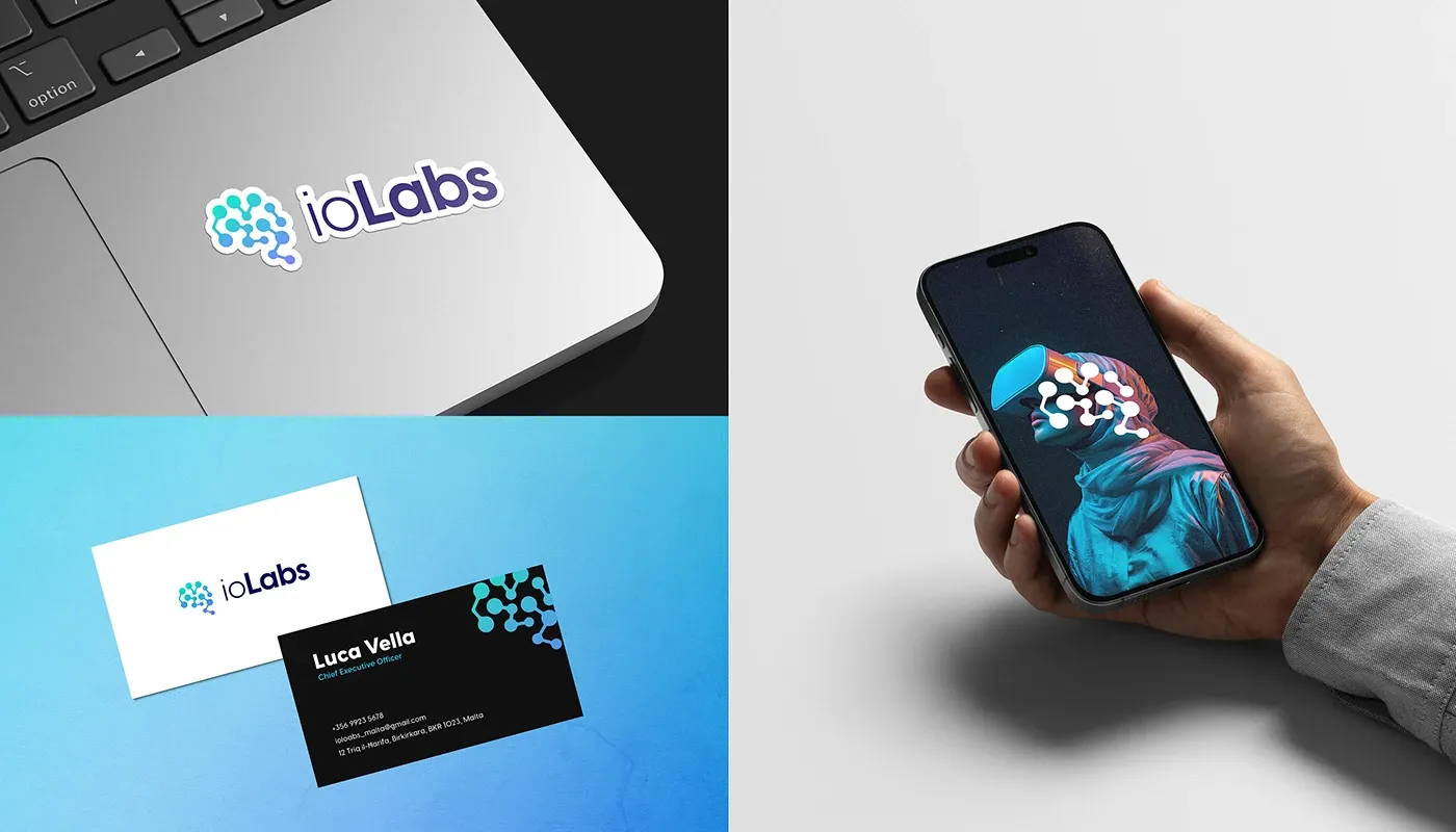
IO Labs operates where artificial intelligence, data synthesis and real-time analytics meet. Its brand needed to carry that weight credibly, on four pillars: innovation, expertise, empowerment and transformative impact. We anchored the identity in the human brain: cognitive computing, neuro-inspired algorithms and the synergy between biological and artificial intelligence. The molecular patterning across the visual system represents data networks, sensor integration and the neural architecture of decision-making. The palette was formulated, not picked: deep blue for trust and high-frequency data processing, green for biological intelligence and neural adaptation, purple for creativity and the high-tech frontier. Together they keep the brand scientifically credible across interfaces, documentation and real-world applications.
Services delivered.
Campaign strategies.
Anchored in the brain
Rooted the symbol in cognitive computing and the synergy between biological and artificial intelligence.
Patterns as data
Used molecular patterning to represent data networks, sensor integration and neural decision architecture.
Colour by association
Selected each colour for its psychological link to AI and data: blue for trust, green for adaptation, purple for innovation.
Credibility across surfaces
Tuned the system for clarity on digital interfaces, research documentation and physical applications alike.
What it proved.
The IO Labs identity does what the company does: it turns complexity into clarity. A symbolic mark, a formulated palette and a molecular pattern system now carry the brand across real-time intelligence, AI-driven safety and healthcare, credible in every context it enters.
The advantage.
Scientific credibility and technological authority baked into every asset
A flexible pattern system that scales from app UI to environment graphics
Positioning strengthened for long-term growth across AI-driven industries
The mark and the molecule.
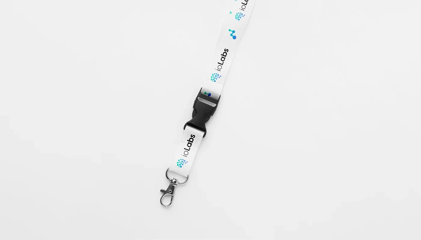
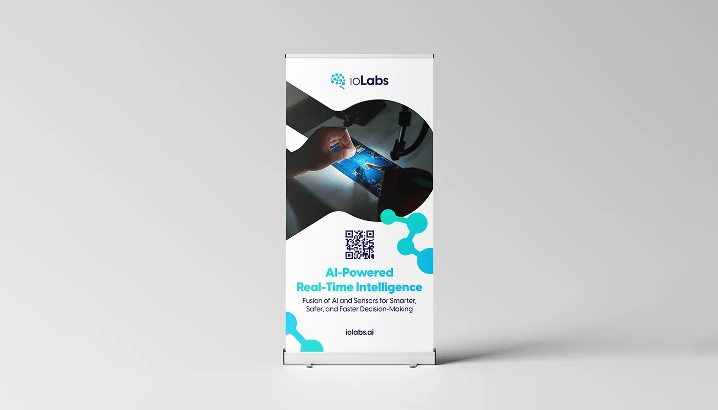
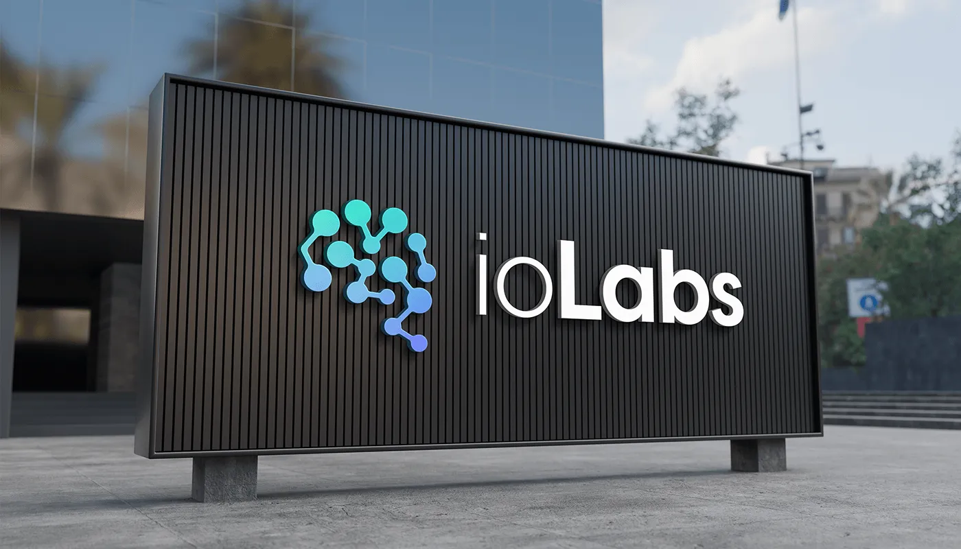
A brain-inspired symbol and molecular pattern language, built to represent data networks and neural architecture.
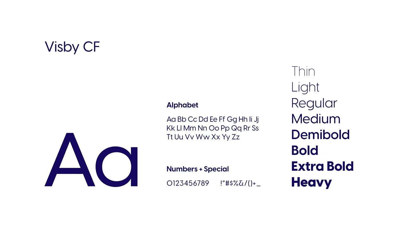
Colour and system.
Deep blue, green and purple, each selected for its association with trust, adaptation and innovation.
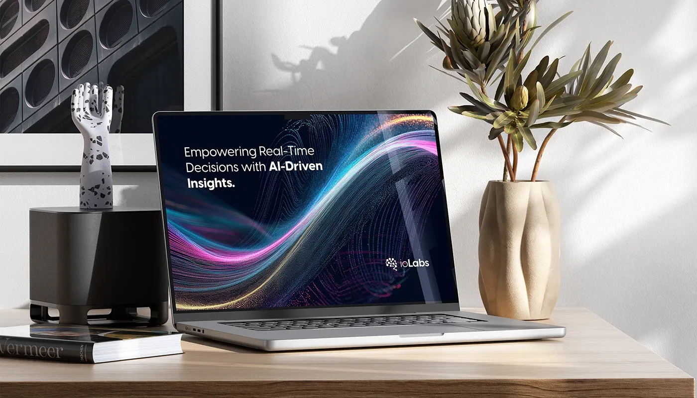
The brand in application.
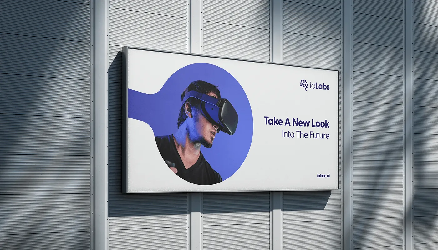
Interfaces, documentation and environments, one system keeping the science legible.
What our clients say.
The Growth Bully's targeted approach brought us quality leads, increasing inquiries and bookings for Busy Bee. Their commitment made a real difference.

Duncan Friggieri
Business Development Manager at Busy BeeThe Growth Bully has been a true partner, delivering tailored strategies that drive lasting growth and impactful results.

Alexia Sant Manduca
Director at Fontanella Tea Garden & Vinum Wine BarThe Growth Bully's campaign boosted engagement and delivered results for our core skincare offerings.

Maria Bugeja
CEO at NiumeeThe Growth Bully revolutionized our eCommerce sales with precise targeting and optimized ads, achieving impressive ROI.

Carolina
Marketing Manager at LiquigasWorking with The Growth Bully has been seamless and rewarding. Their professionalism and strategic approach consistently deliver impressive results.

Joseph Barbara
Director at James CaterersThe Growth Bully has been an exceptional partner, combining professionalism and expertise to consistently deliver outstanding results.

Zach Ciappara
CEO at FreeHourOther projects.

Let's get started.
Book a call. We'll look at what you are running, where the money leaks, and what we would fix first.